• About Me
  • Portfolio
  • Blog
  • Contact
tanjajohansson
  • About Me
  • Portfolio
  • Blog
  • Contact

23rd April: Book Cover Design 'Thirteen Reasons Why'

13 REASONS Book Mock Up.jpg

For this project, I was intrigued by the significance of the audiotapes in the story and the entire experience the narrorator is thrown into, forced into the task of listening to them all and passing them on others on a list. In particular I liked the fact that even though the story takes place in the present that the character Hannah creates these audiotapes, an out of date technology, diliberately making it difficult for Clay and the others to listen to them and complete the task Hannah set them.

I wanted to recreate that same experience for the readers by transforming the actual book into an audiotape, from the outside cover suggested a casette tape sleeve and the book and pages tinted in dark grey like an actual tape. I wanted them to feel a connection to Clay, holding the tape and being in possession of Hannah’s confessions. 

For the typography I used a handcrafted font, but tried to suggest the rage the character Hannah was in while creating the tapes, angrily writing in red felt tip across the cover and scribbling in notes to the listeners.

Monday 04.23.18
Posted by Tanja Johansson
 

6th April: Book Cover Design for Tana French's 'In the Woods'

IN THE WOODS WIP (cover only).jpg

What triggered this personal brief was a visit to the exhibition ‘Into the Woods’ at the V&A. Seeing a black and white image of these slender trees in a haze made me think of the book’s protagonist, Detective Ryan and how even as the narrorator he admits to twist the truth and how by the end of the novel so many questions remainded unanswered. I was inspired for this brief to use watercolours to create that same soft faded look of the trees in the forest. My concept was ‘Blurred’, keeping in black and white. Handpainting in various brushes, paint thickness and strokes, I loved how each line really comes across as a tree trunk against the white backdrop. For the typography I wove the text in and out, like it’s walking through the trees, and kept the layout low and high to maintain that blank space of the forest. 

IN THE WOODS Mock Up.jpg

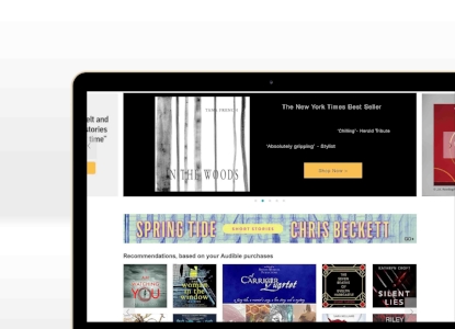
For the mock ups, as well as the usual responsive design in digital format I included a page from the Audible website. 

IN THE WOODS Audible page .jpg

I always love the excuse to do something handcrafted for a project, and I’m really proud of how the blank space enhances the forest scene.

Friday 04.06.18
Posted by Tanja Johansson
 

26th Feb: Brand Identity and Digital Design: FOCUS Podcast

FOCUS Logo FINAL LOGO.jpg

I’ve been keen to try briefs that broaden my portfolio, starting with branding for an original Podcast. This was a refreshing challenging, thinking of something thats auditory and how to market it visually. 

FOCUS iphone Mock up LOGO.jpg

The concept behind this podcast was that helped listeners concentrate, removing distractions and fine tuning their strengths to reach their goals. I looked at well being podcasts like Headspace and their increasing popularity in today’s anxious driven atmosphere and how digital can be soothing rather than fast paced in our daily routines.

For the logo I was inspired by an eye make up palette, the geometric layout in shades of blues and greens and used that for the icon design, the boxes illustrating bringing together strengths and blocking out obsticles. The muted colours are meant to have a cleansed yet sharpened feel that suggest clarity.

FOCUS Live Event Mock Up LOGO.jpg

For roll out, as well as a podcast play screen, I created a poster for a live panel event, adding photos the podcast speakers behind the logo colourlay.

Monday 02.26.18
Posted by Tanja Johansson
 

24th Feb: Brand Identity Logo Design: Remember the Brave Charity Foundation

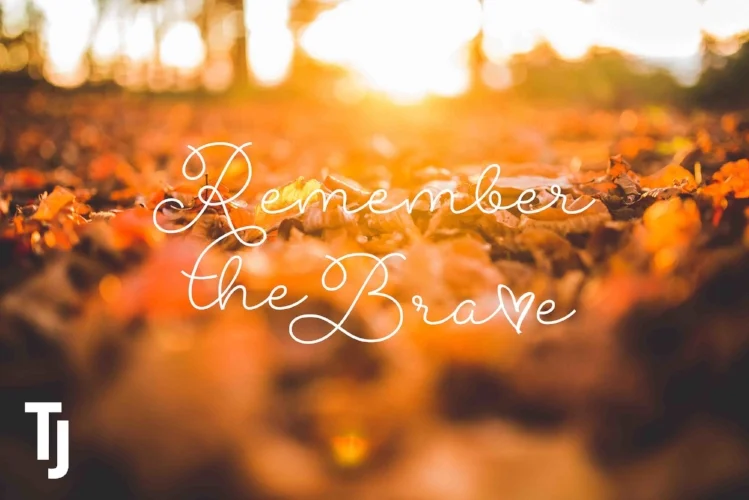
REMEMBER THE BRAVE Autumn Mock Up LOGO.jpg

For this entry for a competition to design a logo for a youth charity, keeping in mind how it would look set in stone, I kept to a simplistic typeface but added in the visual of the heart motif incorporated into the letters R, B and V. 

Saturday 02.24.18
Posted by Tanja Johansson
 

Book Cover Design: Alias Grace

ALIAS GRACE Book Mock up LOGO.jpg

After finishing watching the series on Netflix, I was struck by the final scene of Grace sewing the last pieces of her quilt. Each piece reflects different aspects of her story, and I find it chilling how at the end we’re not sure if she really was innocent or guilty. For the book cover I took the simple image of patchwork in pure pale blues and whites and added splatters of blood. The typography in the same red contrasts well against the blue and my choice of font hints at the Doctor’s note taking throughout the book. 

ALIAS Grace iPhone Mock Up LOGO.jpg

For roll out I wanted to go behind print so I created the Audible mock up, pushing past my usual portrait layout for book covers and considering responsive UI design.

Friday 02.23.18
Posted by Tanja Johansson
 

22nd Feb Music Album Cover Design: ‘Stand’ by Meg Donnelly

STAND COVER BLACK LOGO.jpg

When I first listened to ‘Stand’ from the Disney Channel Original Movie ZOMBIES, I loved how it’s message is so relevent movements including Time’s Up and MeToo today. Disney was clever in creating a kid-friendly story with a strong message of segregation. I was genuinely moved by this musical sequence in which a character makes the first step in standing up to discrimination by revealing her genetic disorder. Loads of artists are releasing singles featured in movies-look at Keala Settle’s hit This Is Me. It got me wondering how to market this particular song.

So I was inspired to do this original brief as my first ever music album cover. My concept, while strongly defient was stil muted, considering the power ballad more of a personal first step rather than a full out declaration of revolt.

I wanted something that was in sync with current trends-minimal, edgey and sleek. I took a black and white photo of the singer and actress Meg Donnelly that could work with against light and dark background. 

Still wanting to acknowledge the Disney Channel brand and its young target audience I took the primary colours of neon pink and lime green used in the film title for the typelock. Inspired by graffiti I scribbled with pink and green marker to scan and overlay  with a handcrafted font for the song title. For other text I kept the typography small and discrete. 

STAND COVER WHITE LOGO.jpg

I created the basic layout in both black and white, though admittedly the typography worked better in the black backdrop. Roll out includes the album playing on Spotify, as well as a record sleeve and poster advertising the single’s release.

STAND A3 Poster Mock Up LOGO.jpg

Have to say I am really proud of this brief, how I created something that’s bold and striking while working with brand guidelines, promoting the artist and her talent. And I just love how the type lock pops! Definitely one of my personal favourites up to now!  

Thursday 02.22.18
Posted by Tanja Johansson
 

4th Sep: BLOK Original Fashion Brand

BLOK Promo shot.jpg

For a recent job application for a vintage marketing agency, I wanted to conceive a fashion label that represents upcylcing in a non-crafty light, more edgey rather than shabby chic.

I had the idea of a brand that takes discarded fabrics, using colour blocking to create cool upcyled clothes that doesn’t LOOK upcycled on first glance. The name BLOK came from ‘colour-blocking’, where I made the typography chunky and sliced like the fabric pieces themselves. For example, the logo design promo shot’s background image is made up of different fabrics (leather, lace etc) all in black. 

BLOK Tag Mock Ups.jpg

This project was a great method to branch out from my usual handicrafted aesthetic, and I have new appreciation for geometrics and modernism.

BLOK Iphone Mock Up.jpg
Monday 09.04.17
Posted by Tanja Johansson
 

2nd Aug Logo Brief: ‘Casuarina Properties Ltd.’

Recently I was approached and asked to produce a logo for an independent real estate branch. The client had several specifics in mind, including this teal shade and tree silhouette, a nod to the tree around his family’s holiday home. While developing the tree sketch, the biggest I found was how ugly the Casuarina tree can be, with not leaves but needles, looking more like hair! Eventually we agreed on this design, with a side logo featuring just the tree shape. 

Wednesday 08.02.17
Posted by Tanja Johansson
 

Packaging Brief: Literary Inspired Chocolate

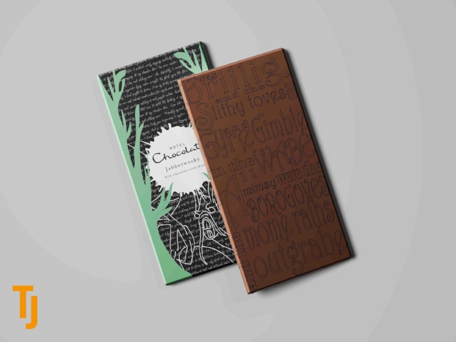
This project was a recent entry for a job application, to create a piece of packaging for a chocolate line. Intrigued by the company’s best selling product, chocolate slabs with intricate designs or typography, I developed this line of chocolate bars for a Halloween line inspired by ‘creepy’ literary figures. The chocolate bars themselves have lines from the poems, and the packaging is decorated in rough scribblings and ink splatters in the shapes of the poem subjects (ravens etc.). The paper wrapping sits in a laser cut sleeve with the outline of an eerie forest silhouette. A nod to the work by Edgar Allan Poe and Lewis Carroll, it was a unique take on a seasonal line.

HC Dielines.jpg
Wednesday 08.02.17
Posted by Tanja Johansson
 

Branding Brief: ‘Dffrnt’ Jewellery Studio

I had this idea recently for a personal branding project-a jewellery Designer who specializes in personalized bespoke pieces made from various treasures the clients bring. The tagline ‘wacky, weird, wonderful’ pretty well sums it up, taking the idea of accessories can take an ‘everything but the kitchen sink’ approach and sky’s the limit, depending on the personal attachment to the object d’arte.

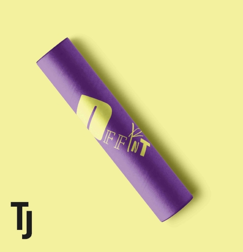
The typelock is meant to look mishmashed, miscellaneous pieces that are brought together. Using different fonts and styles and eliminating the vowels, it emphasizes how the brand stands out in the industry. 

I rolled out the brand concept across from signage to packaging to a website, where for custom orders customers fill out a survey with what they’d like created and have an option of sending a photo of the piece they want included.

Tuesday 05.09.17
Posted by Tanja Johansson
 

Original Poster for 'Corpse Bride'

A brief I made for a job application for agency specialising in the performing arts, I created this poster on the idea of choreographer Matthew Bourne recreating another Tim Burton classic, following the same guidelines of the New Adventures da…

A brief I made for a job application for agency specialising in the performing arts, I created this poster on the idea of choreographer Matthew Bourne recreating another Tim Burton classic, following the same guidelines of the New Adventures dance group for layout, visuals and typography. The film is a personal favourite of mine! I love the general sweetness of Burton's films, how all his characters are different and off-putting but so well intentioned there's a sweet tenderness to each story. I found the gorgeous image of a skeletal silhouette online and added the veil. The butterflies are a constant symbol of the title character, appearing throughout the film, and made a lovely border motif. The typography is eerie yet romantic, true to the Victorian time period. Finally for colour I wanted to deviate from the film's blue palette with purple instead. 

Wednesday 03.15.17
Posted by Tanja Johansson
 

26th Jan ‘APE’ Cosmetics Logo Design

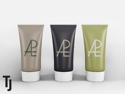
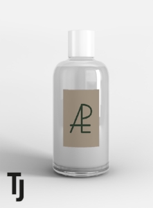
I recently entering a freelance competition, with the brief for a cosmetics company called for a logo with emphasis on typography that was gender neutral, simplistic with an organic colour palette. Brainstorming I was intrigued with the idea of evolution, scientific and ever changing but always building on the foundations of basic DNA coding. I looked at sharp, recognizable logos such as MAC Cosmetics and developed this logo typelock, morphing and drawing the alignment and lines of the letters together. 

Thursday 01.26.17
Posted by Tanja Johansson
 

19th Jan Vegas Watercolour Icons

I was just in Las Vegas Nevada, celebrating my 30th birthday (GOOD TIMES!!!) and on the plane back started doodling these icons, from gambling chips to playing cards for my watercolour series. Considering doing a series for each city I've been to. Viva Las Vegas!

Thursday 01.19.17
Posted by Tanja Johansson
 

Harvey Nichols and Harrods Christmas Windows

Made my annual trip to visit the festive window displays at iconic stores Harvey Nichols and Harrods on Knightsbridge. My thoughts…meh.

    Yeah, can’t say I was all that impressed this year. Harrods was especially disappointing! Decorated by Burberry, at first the white cut out sets seemed promising, but the product placement and marketing appeal-dismal. It felt so bland and basic compared to Harrod’s colourful sweet and incredibly detailed past displays! And not a single of the iconic Harrods mice in sight.

    Harvey Nicks was far more appealing. Also with a white background, but far more imaginative with masked mannequins indulging in the stores' stocks from wine to perfumes. A way more eye-catching backstory and set up. Christmas displays should be packed with clutter, fun characters and cheesy yet cutsey festive scenes and urge people to cause gridlocks on the pavement in front of them!

    Not as memorable as previous years. There’s always next year!

Wednesday 12.14.16
Posted by Tanja Johansson
 

10th Dec-Christmas Watercolor Icons

This project just keeps going, with more ideas. And with the holidays approaching, I was in a festive mood and created these, including wreaths, Christmas crackers and holly. Happy Holidays!

Saturday 12.10.16
Posted by Tanja Johansson
 

9th Dec-Current Project-Geisha Branding

IMG_5600.JPG

In Japan I spent one evening at a Geisha teahouse. I loved hearing about the Giesha career path, their daily routine and training and seeing their gorgeous performance.

    Two recently graduated Maiko (trainee Geisha) gave us little souvenirs; 2x6cm stickers with their name and a gorgeous pattern design. This is actually a form of business card. We also received tea cloths and chopsticks after the evening. We were also shown a room where fans decorated with the names of all Geisha associated with the teahouse adorned the walls.

    I loved the designs and kanji, and came up with this project for branding an individual Geisha or teahouse. It had me thinking of how amazing the Japanese are in finding ways to integrate old customs and methods into the modern era. 

    Brainstorming I made up my demographic ‘Natsumi’, a recently debuted Geisha. She is fascinated by history and the role of Geisha, but wants to merge those iconic motifs in a new vision for her business cards and leave behinds. It’s a challenge to be bold but remain respectful of traditional customs.     

GEISHA Cards Final.jpg

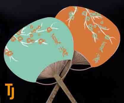
    Researching Japanese textiles and the meanings behind certain kimono colour palettes, as well as considering the namesake Natsumi (Spring Beauty) I developed this cherry blossom tree design in chalk pen strokes with a bright bold teal, orange and monochrome colour scheme. I’m always a fan of rolling out artwork and rotating the colour scheme!

GEISHA Mock Up (72).jpg

    When considering leave behinds, I kept in mind something that’s small and light-Geisha carry their belongs in the heavy sleeves of their kimonos or tucked away in their obi. In addition to business card stickers, I rolled out the artwork with chopstick packing and fans. 

Friday 12.09.16
Posted by Tanja Johansson
 

Conversation with #DonatellaVersace @V&A Museum Dec 4th

Couldn’t believe it when I’d heard of the chance to attend a live event of one of fashion’s most incredible icons. Since becoming head of the company, Donatella has made an incredible impact in bringing the brand into modern culture. Today she’s more famous than the celebrities she dresses!

    The event was in collaboration with a new book Donatello’s just written, featuring photos never seen before and celebrating the Versace ‘family’, both the brand and the individuals.

    I was really struck by how humble and sweet this fashion megastar was! Despite her heavy eye make up and clunky platform boots as she took the stage, she came across as timid and shy! When images of her naked from previous shoots were shown, she simply muttered ‘thats not me’, denying she could be that beautiful creature! 

    True, I wouldn’t have minded to hear more about her design aesthetic, but in particular it was insightful hearing her thoughts of social media. It’s become such a force in the industry, with the web opening up so many individuals who are now held in equal regard to the likes of Anna Wintour, and such a relevant platform today.

    By the end I felt we’d only skimmed the surface of such a remarkable individual. Thanks for hosting this, V&A!!

Monday 12.05.16
Posted by Tanja Johansson
 

29th Nov-Japan Inspired Watercolours Icon Series

Having just returned from the trip of a lifetime in Japan, I am revving with inspiration! From visiting anime hub Radio Kaikan in Tokyo to the lush hot springs of Kanazawa, Japan is fascinating in how it’s traditions remaining consistent while still innovative with its innovative and bold entrepeneur attitude.

    I started sketching these icons right away at the airport. From sushi dishes to floral motifs, just unpacking and looking through momentums I collected gives me new ideas for designs. So this watercolour iconography series continues. Konichiwa!

Tuesday 11.29.16
Posted by Tanja Johansson
 

Sat 12th Nov Watercolour Icon Series

HUGGLE Animal Icon 2.jpg


For a brief recently I was racking my brain for a unique brand look, with a watercolour touch. But when doing a stationary run in Rymans and spotting this colouring book, where the artist gave splotches of watercolour paint character with pen illustrations, inspiration struck! 


I’ve been doodling these since, painting circles and rectangles in different watercolours, overlapping in tones and shades for a more organic look. From there I scanned and placed the different drawings on top. It started with animals, taking key features of different species-I took ideas from these felt animal masks I made last year. But its continued to everyday objects, like books oreyeglasses. Taking high tech things such as iPhones and headphones and giving them a unrefined pen outline made a great contrast. A fun project that deviated into an exploration in alternative iconography. 

HUGGLE Animal Icon 1.jpg
Saturday 11.12.16
Posted by Tanja Johansson
 

#CreativeMornings @SecondHome with Stephanie Posevec

This was my second Creative Morning, and have been looking forward to each and every one, hearing from creatives in the industry and leaving so inspired!    This morning at Second Home (side note, really cool building! Amazing layout …

This was my second Creative Morning, and have been looking forward to each and every one, hearing from creatives in the industry and leaving so inspired!

    This morning at Second Home (side note, really cool building! Amazing layout right around the corner from Sheffield's Market), attended a talk by designer Stephanie Posevec. It’s great to hear from a designer who isn’t afraid to step away from their laptop and work with their hands to create beautiful illustrative work. 

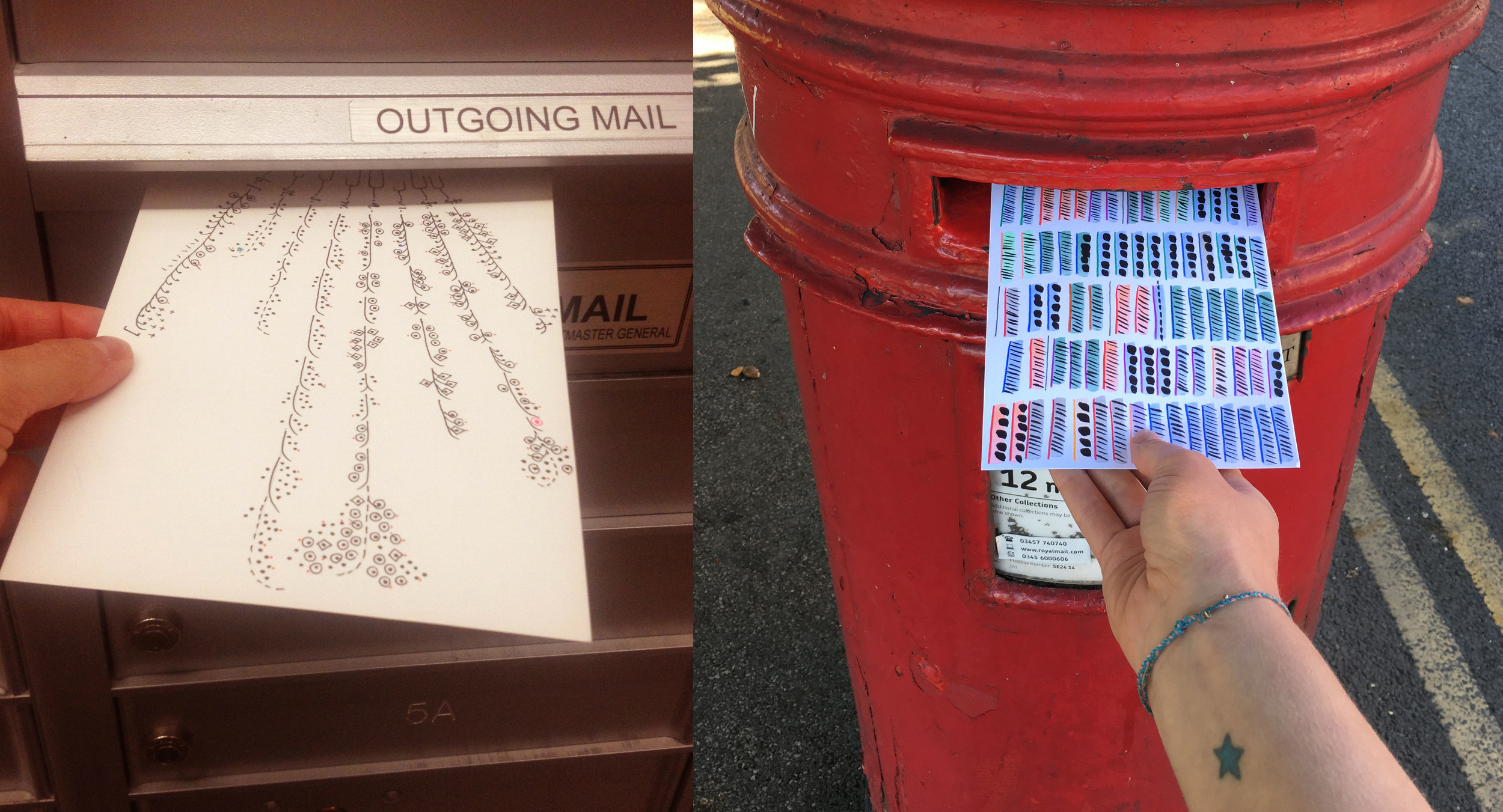
    The lecture focused on #DearData, a collaboration with fellow designer Giorgia Lupi that's been made into a book coming out this month. This project’s mission was a series of hand drawn postcards to one another, North American and UK, experimenting with infographics and data collecting.

    When I hear the word ‘data’, I think cold, hard facts. Posevec advocates for data being so much more! Information that starts as something small but becomes a conversation point to build on. Each postcard has an idea to record, specifically steering clear of data technology can’t record-how many times they’d hugged their loved ones, the number of times they laughed, etc.! It was lovely to see that emotional raw unrefined representation of those statistics in their adorable hand drawn work. How does one turn something so personal and priceless into a set of statistics?

    Posevec had so many pearls of wisdom! For example, how imposing constraints (only draw things by hand, don’t use the colour purple or orange) initiates so much opportunity for pure creativity. Necessity is the mother of invention, after all.

    So worth the early start, and I’ll be grabbing a copy of Dear Data when it comes out!  

tags: Creative Morning, Second Home, Stephanie Posevec, dear data, Giorgia Lupi
Friday 08.26.16
Posted by Tanja Johansson
 
Newer / Older

© Tanja Johansson